Dear Moderator
Hello. Hope you enjoy looking through my A2 blog.
My Research and Planning started in September, I began my Evaluations at the start of March and my final teaser trailer, magazine and poster follow after.
Thank you for your comments and guidance throughout this year. They have been appreciated!
Amy!
:)
My Research and Planning started in September, I began my Evaluations at the start of March and my final teaser trailer, magazine and poster follow after.
Thank you for your comments and guidance throughout this year. They have been appreciated!
Amy!
:)
Friday, 22 March 2013
Evaluation Question 4 - How did you use media technologies in the construction and research, planning and evalution stages
WordItOut was a fun and interesting way to put words together to find out our production and distribution company logo names. It was easy to use and very quick but still effective.
I didn't find Solvr as helpful as WordItOut and Prezi but it was still fun to be able to use more technologies. Solvr was quick to use and after being shown how to did it, it was easy. We used it to come up with a film name.
I used SLR cameras to take pictures for my magazine and poster. We was taught how to use SLR's in AS so it was easy to do.
I had never used a video camera until making my trailer so I was using it without experience, but I found it easy to use, and because I wasn't in charge of cinematography, I didn't have to film as much.
I used my standard digital camera for test shots for my research and planning.
I used Garage Band to create all of the sound for our trailer. After a while of having to have help, it got easier to use.
iShowU was used for podcasts which I used for this evaluation question. It is really easy to use and also really helpful.
I used Photoshop for my magazine and poster. I have been using Photoshop for two years now so I know how to use it. Its quick and easy to use.
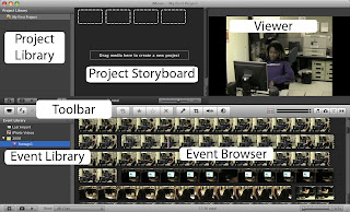
Once you've got your footage it will go into your 'Project Library'
Your toolbar has buttons which you can use to add editing transitions which I talk about in my video. You can also record your voice or sound effects through the record button.
Where it says event browser, that is the part where it shows all your footage which you can highlight and then drag and drop into your Project Storyboard.
Once you have edited all of your clips and made your video, you can press play and watch it back on the viewer.
Thursday, 21 March 2013
Question 2 - How effective is the combination of your main product and ancillary tasts
From all pieces of my work, Josh features in all of them. I tried to use the same representation but making it a bit more different on the poster, because the poster is the main product which will make an audience want to watch the film. In the poster I tried to make Josh look like the villain by using a close up on his face with a red tinge on his eyes to suggest that he is the bad one. In comparison, my magazine is different to this, as the picture is quite natural because it hasn't been edited as much as the poster. I also use a High angle shot to make him look like the victim not the villain. Throughout the trailer there is a number of shots of Josh, first of all in the equilibrium where Josh is happy and laughing, this suggests that he is the victim not the villain but the last shot of the full trailer suggests otherwise. My magazine goes with the start of the film, whereas the poster goes with the end making the representation quite even.
Good Vs Bad
In my magazine and poster there is only one person, so it is hard to see if he is good or bad, but there is a slight edge which makes the character look better in the magazine than in the poster. Once you look closer, into the trailer though, an obvious good vs bad starts to appear with the character of Abbie, Josh's best friend who wont believe that Josh is dead.
Colour/Lighting
The colour is different for the character of Josh on all 3 products. On the poster, there is high key lighting which isn't a regular feature of a horror poster, but I really like the effect and with the shadows on Josh's face and the red eyes, the high key lighting doesn't take the edge off the horror side to the poster, which was my main worry. my magazine has quite natural lighting as I didn't edit it as much as the poster or the film. In the film, we put an effect over all of Josh's shots so that there was an obvious theme throughout the trailer.
Location
I used a brick background for all of the shots from my poster, magazine and shots with Josh in it on the film. I did this so that the audience would see a relationship between the three products and it would be an iconic part of the finished product.
Text
Throughout all three pieces of my work, I have tried to use similar texts, for example, I used the same font for the slugline on my poster and the slugline in my film. I used a similar font for the word 'Disconnected' in all three of my products.
Question 2 - How effective is the combination of your main product and ancillary tasks?
Subscribe to:
Comments (Atom)


